We are delighted to announce the release of a new analysis module for the Skeepers solution. An efficient reporting system should be easy to use by your functional teams, customisable, make data as easy to read as possible, and offer flexible options for internal sharing. We designed and developed this new module based on these...
We are delighted to announce the release of a new analysis module for the Skeepers solution.
An efficient reporting system should be easy to use by your functional teams, customisable, make data as easy to read as possible, and offer flexible options for internal sharing.
We designed and developed this new module based on these four principles. Our objective is simple and the same as ever; to help you take your customer management strategy to the next level.
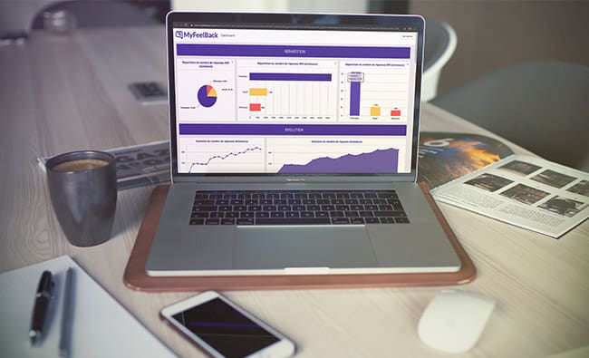
A new module for better Customer Experience management
Skeepers helps you enrich your Customer Knowledge and monitor your Customer Satisfaction. With Skeepers, you can deploy smart surveys every step of your customer journey, at various touch points and on different channels. This enables you to continually collect immediate or delayed data, depending on your objectives, in real time. The answers collected are fed straight into your decision-making dashboards.
If you are a Skeepers user, you are probably already familiar with our dashboards.
We have decided to enrich our software to help you manage the data you collect via surveys in a more efficient, simple, yet advanced manner.
According to a HubSpot study, 75% of companies who do not reach their business objectives do not know their visitors, leads, or customers. We believe that your customers are your greatest asset and that it is more profitable than ever to become “customer-centric”.
To be customer-centric, you have to become data-driven. Yet data analysis is often too complex – making your functional teams (Marketing, Digital, Sales, etc.) reliant on technical analysts.
We designed this new module to put an end to this. Thanks to our solution, you don’t have to be a data scientist to use data.
Managing your data has never been simpler (but not simplistic)
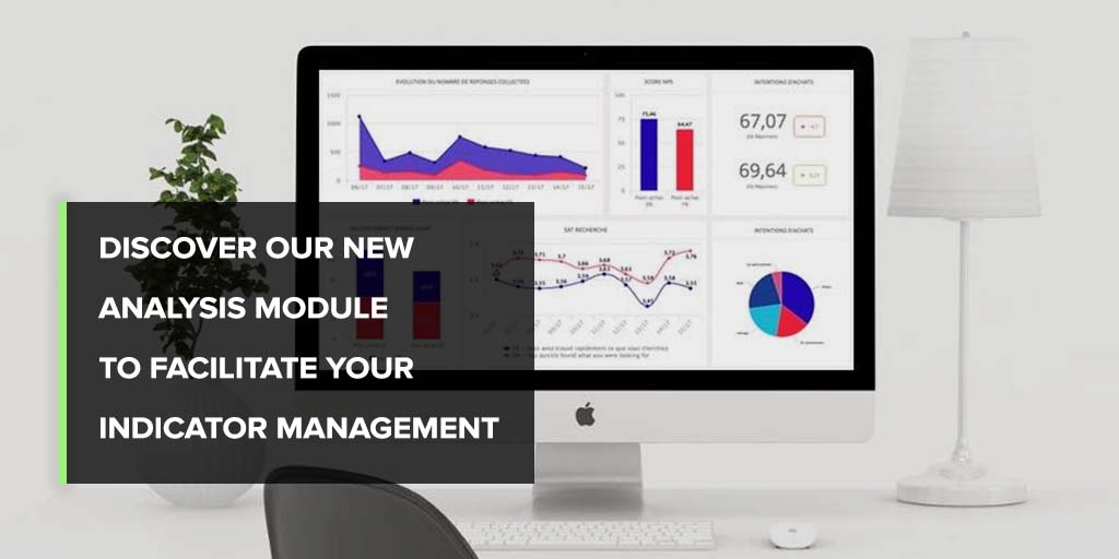
How can you understand your data? Analyse it efficiently? You already know the answer; by using visual representation methods and tools, and transforming your data into graphs, curves, consolidated indicators, bars, as per the Data Visualisation principles.
With our new Analysis module, creating beautiful visualisations for your reports and dashboards has never been easier.
We have redesigned the interface to make it easier for your teams to create and analyse your decision-making dashboards.
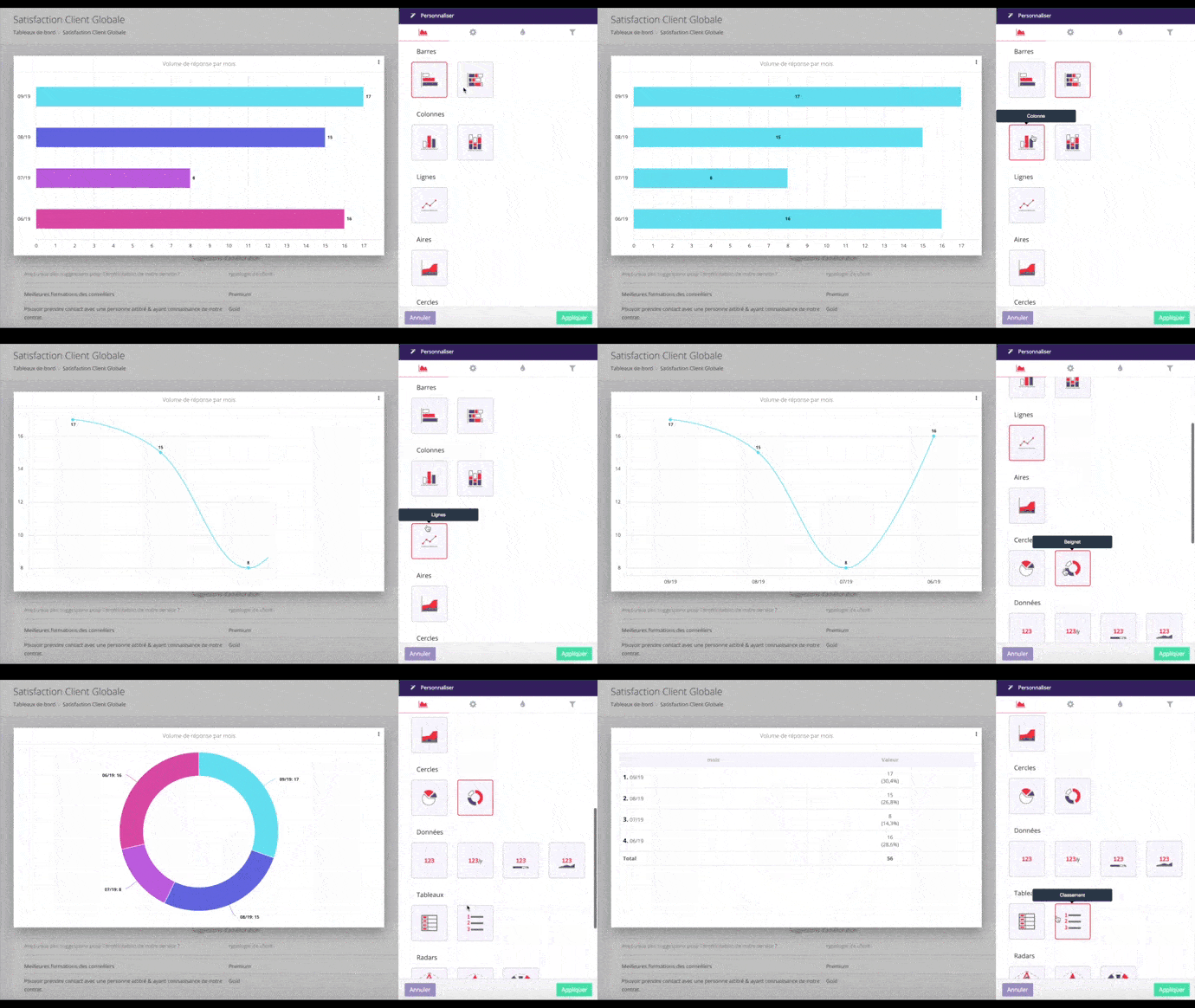
Simple does not mean simplistic, nor does it mean standard. We offer a range of easy-to-use features to help you create custom dashboards and reports that reflect your business challenges, image, management needs and objectives.
Your Customer Experience is unique. Which is why we believe that your reports should be too. Both your indicators and visual representation modes can be customised.
From an intuitive and ergonomic interface, you can:
- Choose the graph types best suited to your data and visualisation needs.
- Customise the design of your reports and dashboards: colours, fonts, layout, size, company logo, etc.
- Configure the adjustment of results to improve their representativeness.
- Compare your results (by score, population, period, etc.) to draw new conclusions.
- Display variations to understand the main changes in your indicators.
- Filter data using custom dimensions.
Easy sharing of your dashboards and reports
Reports and dashboards are meant to be shared throughout your company.
These tools should be used to circulate, share, and use customer data internally. They nourish your corporate culture.
We have therefore done everything possible to ensure that this customer data becomes one of the pillars of your corporate culture.
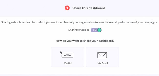
► We have expanded our sharing options. You can now choose the sharing format, and automatically share your dashboards and reports by email or via a URL as frequently as you like. We have increased the number of export formats available: PowerPoint, PDF, Excel, HTML, API, etc.
► Do you work for a multilingual organisation? Our dashboards are dynamically translated according to the recipient’s language.
► For optimal results on all devices, we have developed responsive display.
► You can now restrict access to your reports and dashboards to identified and authorised individuals, through your organisation’s SSO solution.
► We offer a view filtering feature adapted to each department, region, and role.
► It is also possible to add comments to shared materials, to help recipients interpret the results.
In short, you can easily and safely share reports and dashboards in an automatic and cross-functional manner with the right people, via the channels of your choice.


