There are dozens of survey models out there that assess the “usability” of a website, mobile app or software. This article will provide you with an overview of the main UX surveys available to you and introduce you to the 4 models you should know. Read on to find out more! Summary of the Main...
There are dozens of survey models out there that assess the “usability” of a website, mobile app or software. This article will provide you with an overview of the main UX surveys available to you and introduce you to the 4 models you should know. Read on to find out more!
Summary of the Main UX Surveys
UX surveys are designed, as their name suggests, to measure the usability of a system. This system could be a website, a mobile app, or software. There are dozens of survey models and standardised scales with which to measure user experience.
Some models are more general and can be applied to any system. Others are specifically created to measure a website’s UX. Some surveys are very short (2 items) whilst others contain over 100 items!
This article will present the majority of standardised surveys that exist today and then focus on 4 survey models to dive a little deeper.
“General” UX Survey Models
Here is a list of the main “general” survey models, which allow you to assess the UX of a website or mobile app. We have sorted them by level of complexity or, more specifically, by the number of items assessed, starting with the simplest surveys:
- UMUX-Lite (Usability Metric for User Experience), which assesses 2 items and uses a 7-point Likert scale.
- ASQ (After Scenario Survey), which assesses only 3 items and is based on 7-point Likert scales.
- UMUX, assessing 4 items and using a 7-point Likert scale.
- SUS (System Usability Scale), assessing 10 items and using a 5-point Likert scale.
- PSSUQ v3, which assesses 16 items and uses a 7 level Likert scale.
- CSUQ (Computer Usability Satisfaction Survey), which assesses 19 items and uses a 7 level Likert scale.
- UEQ (User Experience Survey), assessing 26 items and is based on a semantic differential scale.
- AttrakDiff, assessing 28 items and using a 7-point semantic differential scale.
- meCUE, assessing 34 items and is based on 7 level Likert scales.
- SUMI (Software Usability Measurement Inventory), assessing 50 items and is based on a 3-point Likert scale.
- PUTQ, which assesses 100 items and uses a 9-point Likert scale.
Survey Models to Measure the UX of a Website
Some surveys have been created specifically to measure the usability of a website. Here are the main models used to measure a website’s UX:
- The perceived usability measuring scale of a website, assessing 8 items and using a 7-point Likert scale.
- SUPR-Q, which assesses 8 items using a 5-point Likert scale.
- EUCS (End-User Computing Satisfaction), which assesses 12 points based on a 5-point Likert scale.
- DEEP (Design-oriented Evaluation of Perceived Usability), which assesses 19 items using a 5-point Likert scale.
Focus on the SUS Survey
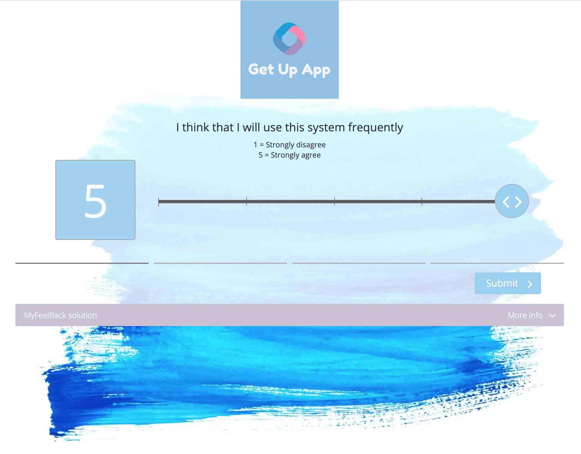
Created in 1986, the SUS (System Usability Scale) survey is a quick and simple survey model to measure the usability of a computer system. It consists of 10 questions and uses a 5-level scale.
The questions have been phrased as first-person statements. Incidentally, we should be strictly talking about “items” rather than questions. Despite “items” being positive statements, they are indeed still questioning its users. Let’s keep using the word “question”.
Here are a few examples of questions used in this UX survey:
- I think that I will use this system frequently.
- I found the system unnecessarily complex.
- I thought the system was easy to use.
- I think I would need technical support to be able to use this system.
- I think the functions in this system were well integrated.
- …/…

The wording of these questions can vary, of course, and “system” should be replaced by the name or nature of the service being assessed: your website, your mobile app, your software.
To find out more about the features, benefits and ways to use this standardised UX survey, have a look at our complete guide to the System Usability Scale (SUS)
The SUS survey is one of the simplest UX survey models. It is simple from all points of view:
- From the point of view of the UX survey creator, who has all the questions ready.
- From the point of view of the UX survey respondent, who won’t take more than 45 questions to tick all the boxes.
Focus on the UMUX Survey
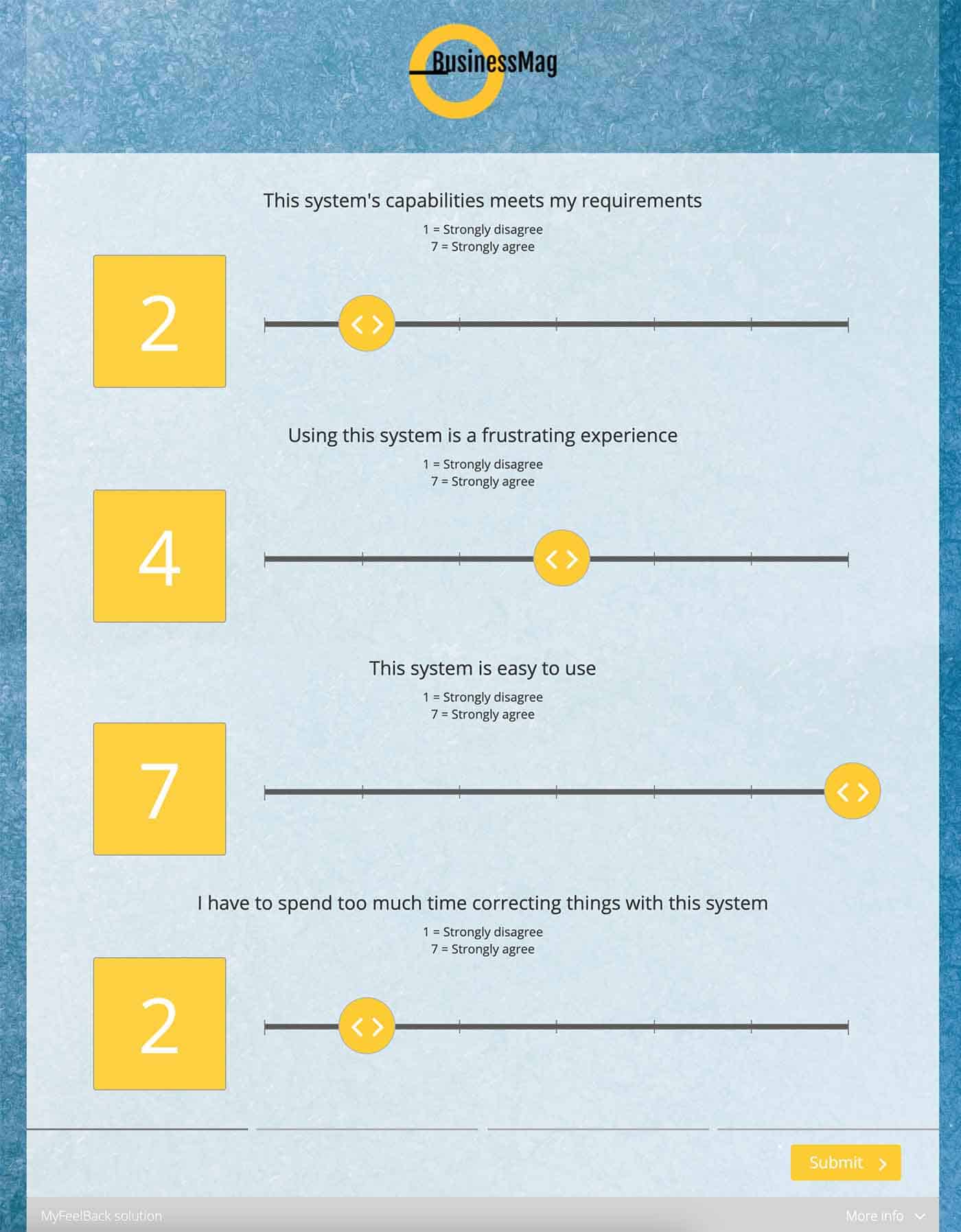
Developed by Intel at the start of the 2010s, the UMUX survey is a UX survey model that is increasingly successful. It’s even shorter and simpler than the SUS survey. It actually only consists of 4 questions:
- This system’s capabilities meets my requirements.
- Using this system is a frustrating experience.
- This system is easy to use.
- I have to spend too much time correcting things with this system.

Questions 1 and 3 are positive statements, questions 2 and 4 are negative statements. The respondent is asked to answer with a 1-to-7-point Likert scale.
While the SUS survey assesses the usability, the UMUX survey focuses more on measuring the efficiency of the service and on the user’s satisfaction. As such, the two survey models adopt two different approaches.
The limitation of the UMUX survey is that it is used much less than the SUS survey and it’s difficult to compare scores in comparison to those of its competitors. Due to this, it’s not always clear if an UMUX score is good or not…
It’s worth noting that since 2013 there is an alternative version to the UMUX: the UMUX-Lite. The UMUX-Lite only has questions 1 and 3 from the UMUX survey, i.e., the positive questions.
Focus on the DEEP Survey
The UX surveys that we just introduced can be used to measure user experience with any type of system: a website, web application, mobile app, software…
This new UX survey model that we are going to introduce you to is, above all, used to measure the usability of a website.
Created in 2012, the DEEP survey includes 19 questions divided into 6 sections, with each section corresponding to a different aspect:
- The content of the website, its usefulness, if it’s interesting, clear, etc.
- The structure of the website and pages, the information layout.
- Navigation.
- The cognitive effort, meaning the amount of effort invested by the user to accomplish the target action.
- Coherence of the page layout.
- Visual guidance.
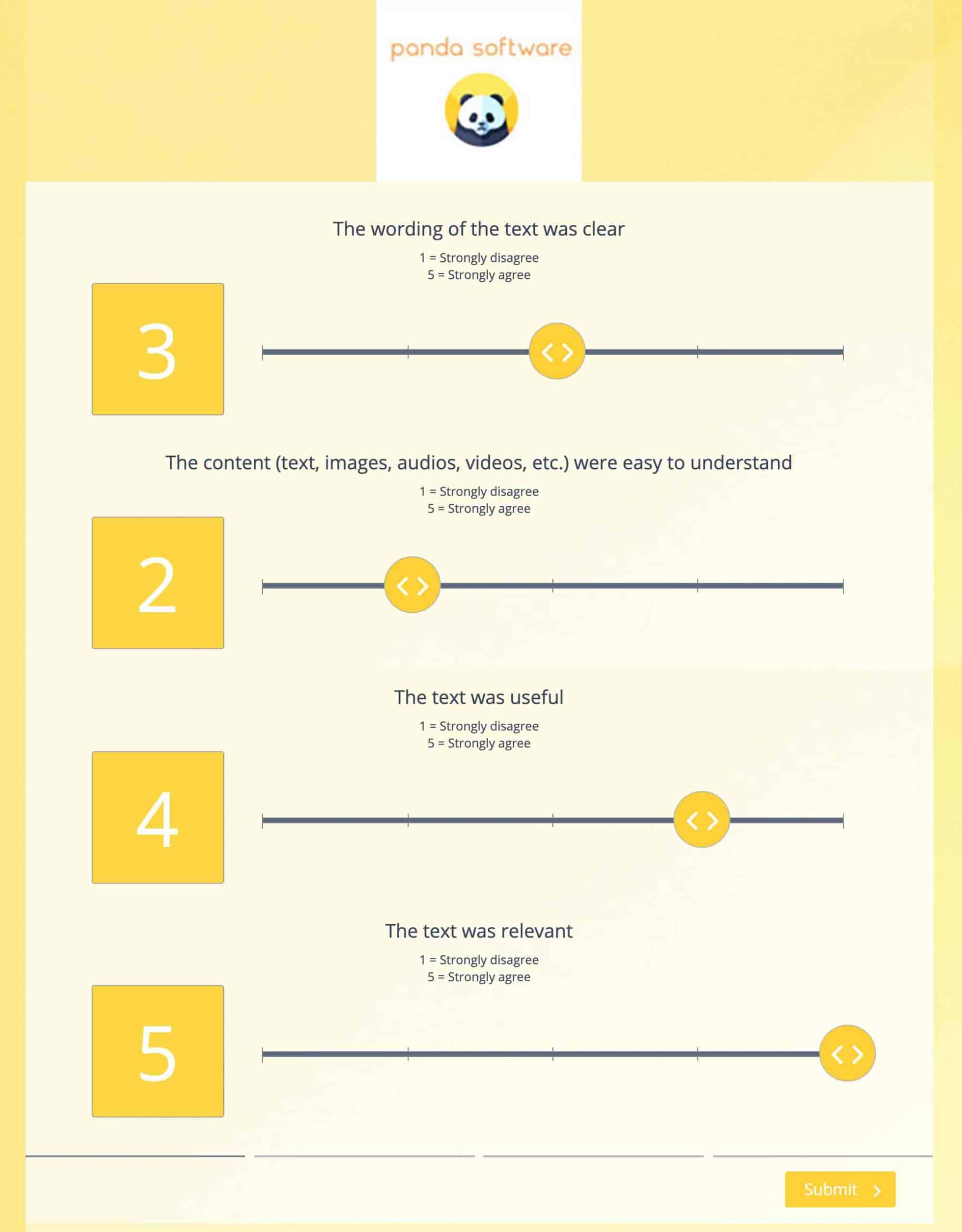
Each “question” is a statement. For example:
- The wording of the text was clear.
- The content (text, images, audios, videos, etc.) were easy to understand.
- The text was useful.
- The text was relevant.

The 4 “question” examples that we’ve just shown you are those connected to the “content”. Note that the statements are written in the past tense.
The respondent is asked to indicate to what extent they agree with each statement by answering using a 5 level Likert scale. The DEEP score is obtained by calculating the average of the answers. The score is therefore between 1 and 5.
Focus on the CSUQ Survey
To conclude this overview of the main UX surveys, we are going to introduce you to the Computer System Usability Survey (CSUQ).
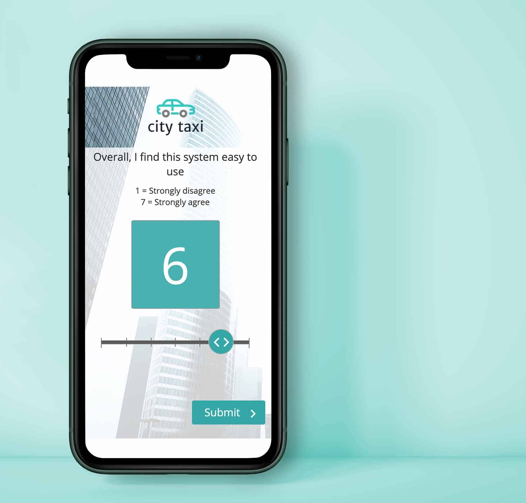
Created by IBM, the CSUQ is a survey composed of 19 items: statements written in the present tense. These items have been grouped into 4 sections:
- Usability of the system.
- Quality of information.
- Interface quality.
- Overall satisfaction.
The CSUQ survey uses a 7-point Likert scale + a N/A box.
Here a few examples of statements/items found under the “Usefulness of the system” section:
- Overall, I find this system easy to use.
- I am able to efficiently complete my work using this system.
- I feel comfortable using this system.
- It was easy to learn to use this system.

As we saw in the first part of this article, there are several (in fact dozens) of standardised survey models to measure the UX of a computer system or a digital system. We chose to show you 4: SUS, UMUX, DEEP and CSUQ. We hope we have provided you with some understanding and ideas you can put in place to measure your UX.
To find out more or to get advice in relation to measuring UX, feel free to get in touch with our team.


